How the Psychology of Color Influences Work Performance
In many modern workplaces, leaders struggle with two persistent challenges: low productivity and a rising sense of employee disengagement. While companies invest heavily in technology, training, and management strategies, one surprisingly powerful factor is often overlooked, the psychology of color.
Research shows that colour influences mood, energy levels, focus, and even creativity, meaning the visual environment employees work in can either support high performance or quietly undermine it. As a result, office interior design has evolved beyond simple aesthetics into a strategic discipline that considers how colours directly shape human behaviour.
Today’s organisations are increasingly turning to office colour schemes designed with psychological insight to enhance well-being and boost productivity. Whether it is using calming blues for focus, energising yellows for creativity, or balanced greens for long-term comfort, the intentional use of colour can transform how people think, feel, and perform at work.
Understanding how colour impacts the workplace is no longer optional, it is becoming essential for creating environments where employees feel engaged, motivated, and able to do their best work.
The Science of Color Perception in Workspaces
Colour perception in the workplace begins with light entering the eyes, where specialised photoreceptor cells, cones, translate different wavelengths into the colours we see. These signals are then processed by the visual cortex, which interprets colour alongside emotional and cognitive cues, meaning that the brain does not just see colour, it feels it and assigns meaning to it. This is why certain hues can increase alertness, evoke calmness, or stimulate creativity.
However, perception is not fixed, it changes significantly depending on the environment, especially the quality of light. Natural light tends to render colours more accurately and softly, creating a balanced and stable visual experience, while artificial lighting, especially fluorescent or overly cool LED lighting, can distort shades, intensify saturation, or wash out colours entirely.
For instance, a soft green wall designed to promote calm and focus may look refreshing and natural near a window during daylight but appear dull or even greyish under harsh overhead bulbs, altering its intended psychological effect. This interplay between colour, light, and brain interpretation is why lighting design must complement colour choices in any workspace aiming to enhance productivity and employee well-being.
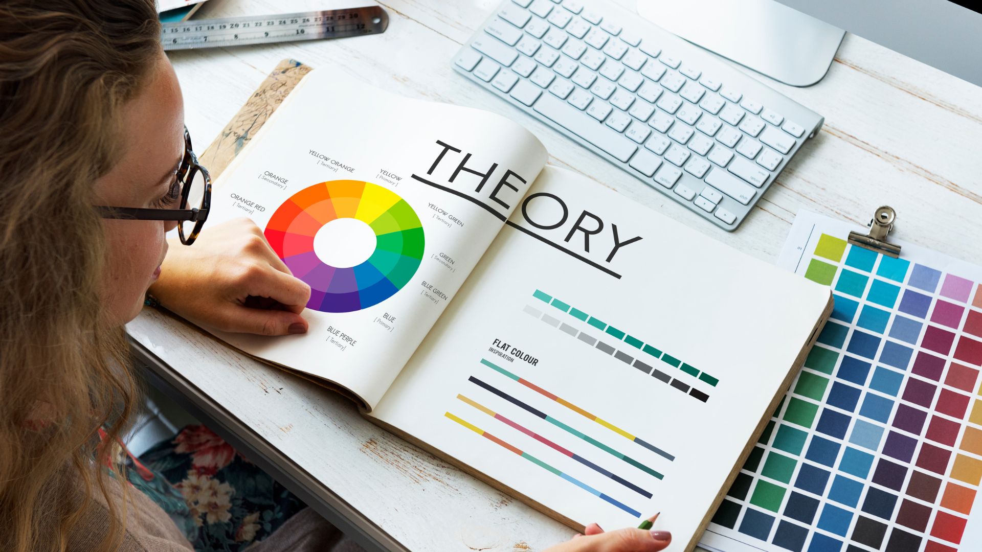
What is the Psychology of Color in Interior Design?
The psychology of colour in the interior refers to the study of how different colours influence human emotions, behaviours, and overall well-being within indoor spaces. It recognises that colour is not merely decorative, it is a powerful psychological tool that can shape how people think, feel, and interact in an environment. Each colour carries its own emotional associations and physiological effects. For example, blues often promote calm and concentration, while yellows stimulate creativity and optimism.
When designers apply colour psychology in interior design, they intentionally choose hues that align with the purpose of a space, whether it is boosting productivity in an office, creating relaxation in a lounge area, or encouraging collaboration in a meeting room. This approach considers factors such as lighting, saturation, contrast, and cultural meaning, acknowledging that the perception of colour can shift depending on context and user experience.
Ultimately, the psychology of color in interior environments helps create spaces that not only look aesthetically pleasing but also support mood, comfort, and performance, making it an essential concept in modern workspace and home design. Moreover, it can sometimes be recommended by the interior designers to follow one’s own ideas and the psychology behind crafting a particular workspace and then grooming it with the colours which soothe the soul and psychology of the employers as well as the employees.
How Does Colour Psychology Enhance Work Performance?
The psychology of colour enhances work performance in the workplace in various ways. The psychology of Colours in interiors also plays a significant role in shaping the way employees feel, behave, respond and perform at work. Far more than a decorative choice, colours influence the brain’s emotional and cognitive development and functioning by impacting concentration levels, creativity, stress, motivation, and overall productivity.
When incorporated thoughtfully into workplace interior design, the colour psychology in interior design becomes a strategic tool for enhancing employee well-being and improving performance across different work settings. Here is a detailed description of how colour psychology in interior design enhances work performance:
- Enhances Focus and Concentration: Cool colours, especially blues and soft greens, help employees maintain mental clarity and sustained attention. Blue is known to lower stress levels and stabilise emotions, making it ideal for tasks that require deep focus and analytical thinking. Green reduces eye strain, which allows employees to work comfortably for longer periods. It matters because it enhances concentration, which in turn leads to fewer errors, improved task completion, and higher overall productivity.
- Boosts Creativity and Innovation: Warm and bright colours like yellow and orange stimulate optimism, imagination, and mental energy. Yellow is often used in creative studios or brainstorming zones because it energizes the mind and encourages out-of-the-box thinking. These colours create an uplifting atmosphere that motivates employees to contribute ideas and explore new solutions. When used in moderation, they help spark creativity without overwhelming the senses.
- Reduces Stress and Supports Emotional Balance: Soft, muted colours such as pale blue, soft green, or lavender promote relaxation and emotional stability. These colours help lower anxiety and create a sense of psychological safety within the workspace. When employees feel calmer, they manage workload pressures more effectively, communicate better, and show improved problem-solving abilities. This emotional balance directly contributes to higher-quality work and better overall performance.
- Enhances Alertness and Attention to Detail: Certain colours, particularly red, increase physiological arousal and heighten awareness. Red accents can be effective in environments where employees must perform precise or high-stakes tasks, as they stimulate quick thinking and boost attention to detail. Although red should be used sparingly to avoid overstimulation, its strategic use can sharpen focus during critical moments of work.
- Encourages Collaboration and Social Interaction: Warm hues like soft red, coral, or peach promote communication, openness, and approachability. These colours are often incorporated into meeting rooms or shared spaces to enhance group interaction and teamwork. By making the environment feel more welcoming and energetic, colour can indirectly improve cooperation and the quality of collaborative work.
Therefore, Colour psychology enhances work performance by influencing employees’ focus, creativity, emotional well-being, and ability to collaborate. When the right colours are used thoughtfully, workplaces become more engaging, comfortable, and mentally stimulating.
Key Concepts of Colour Psychology for Professional Spaces
In professional environments, colour psychology helps shape how employees feel and perform by influencing emotions, focus, comfort, and overall workplace atmosphere. Understanding these key concepts allows designers and organisations to create spaces that support productivity, well-being, and effective collaboration.
- Emotional Influence of Colour: Colours evoke emotions such as calmness, energy, or motivation, shaping how employees feel throughout the day.
- Cognitive Effects: Specific colours enhance mental processes, blue supports concentration, while yellow stimulates creative thinking.
- Physiological Responses: Colours can subtly raise or lower heart rate, alertness, and stress levels, affecting how the body reacts to work demands.
- Spatial Perception: Colour alters how a workspace feels – light tones create openness, while warm tones add energy or coziness.
- Function-Based Colour Use: Different work tasks benefit from different colours. For example, green for long-term comfort and red for detail-oriented tasks.
- Interaction with Lighting: Natural and artificial light change how colours appear, influencing mood and the effectiveness of the chosen palette.
Hence, by understanding these key concepts, organisations can use colour strategically to build workspaces that not only look appealing but also support focus, creativity, emotional balance, and overall performance. Thoughtful colour choices transform professional spaces into environments that help employees thrive.
The Role of Different Colours in Office Interiors
In office interior design, colour plays a crucial psychological role in shaping employee behaviour, mood, and productivity. Each colour carries distinct emotional and cognitive effects, influencing everything from focus and creativity to stress levels and collaboration. Understanding how different colours function in a workspace allows organisations to design environments that support various types of work and enhance overall performance. Hence, the best colours for office productivity are elucidated accordingly:
1. Blue – Focus, Calm, and Productivity
- Promotes concentration and clear thinking: Blue is widely considered the most effective colour for workspaces requiring analytical or detail-oriented tasks because it creates a sense of calm and mental clarity.
- Reduces stress and stabilises mood: Its cool, soothing tone lowers emotional tension, helping employees remain focused for extended periods.
- Ideal for offices, conference rooms, and digital-focused departments: Blue works well in areas where deep work and logical decision-making take place.
2. Green – Balance, Comfort, and Reduced Eye Strain
- Creates a natural sense of calm and stability: Green mimics nature, giving employees a grounded feeling that supports emotional balance.
- Minimises visual fatigue: Because it is easy on the eyes, green helps employees stay productive during long working hours.
- Suitable for open-plan offices, lounges, and focus-driven zones: Its restorative quality boosts long-term productivity without overstimulation.
3. Yellow – Creativity, Optimism, and Mental Energy
- Stimulates creative thinking and idea generation: Yellow activates optimism and innovation, making it ideal for teams that thrive on brainstorming.
- Provides a cheerful and uplifting atmosphere: Its brightness naturally energises the mind, encouraging a positive mood among employees.
- Best used in creative studios, innovation hubs, or collaborative areas: While effective, yellow works best as an accent to avoid overwhelming the space.
4. Red – Alertness, Energy, and Attention to Detail
- Increases physiological arousal and awareness: Red boosts heart rate slightly, making employees more alert and responsive.
- Enhances performance in tasks requiring precision: It is especially effective in work areas where accuracy and quick decision-making are essential.
- Best used sparingly in high-focus zones or meeting spaces: Overuse of red can cause stress, so it functions best as a strategic accent.
5. White – Cleanliness, Clarity, and Simplicity
- Creates a sense of openness and brightness: White reflects light, making offices feel more spacious and clean.
- Supports focus by reducing visual distractions: Its simplicity allows employees to concentrate without unnecessary stimulation.
- Best used with accent colours to prevent sterility: Too much white can feel cold or uninspiring, so it’s most effective when paired with warmer tones.
6. Grey – Neutrality, Professionalism, and Balance
- Provides a sleek, modern, and professional look: Grey acts as a stabilising neutral that adds sophistication to office interiors.
- Helps other colours stand out: It provides a balanced backdrop that supports strategic use of bold accent colours.
- Ideal for corporate offices, meeting rooms, and tech environments: However, too much grey can feel dull, so it benefits from warm or vibrant accents.
7. Brown & Earth Tones – Warmth, Stability, and Comfort
- Create a grounded, welcoming environment: Earthy colours reflect natural materials, promoting comfort and reliability.
- Reduce stress and support emotional well-being: These tones help employees feel secure and at ease.
- Suitable for reception areas, private offices, and collaborative spaces: They add warmth while maintaining a professional atmosphere.
Therefore, every colour plays a unique psychological role in shaping how employees feel and perform in an office interior. By combining the best colours for office productivity, the calming effects of cool tones, the energising qualities of warm hues, and the grounding strength of neutrals, designers can create workspaces that boost productivity, well-being, and creativity. Thoughtfully chosen colour schemes ultimately help transform ordinary offices into environments where employees thrive.
Trending Office Colour Schemes for High Performance
Modern high-performance office colour schemes blend psychology-driven choices with contemporary design to create spaces that support focus, creativity, and well-being. The office interior design trends lead the trending palettes to include soft blues and muted greens, which promote calmness and sustained concentration, making them ideal for focus zones and open work areas.
Warm neutrals, such as beige, taupe, and warm grey, are also popular for creating comfortable, grounding environments that prevent visual fatigue. To energise collaborative spaces, designers are incorporating vibrant accents like mustard yellow, coral, or burnt orange, which stimulate creativity and communication without overwhelming the senses.
Biophilic-inspired palettes featuring earthy browns, forest greens, and natural wood tones continue to trend, as they reduce stress and create a restorative atmosphere. Additionally, modern offices are adopting monochrome schemes with bold highlights, such as charcoal paired with teal or black paired with emerald, to add sophistication while supporting mental clarity. Together, these trending colour schemes reflect a shift toward offices that are not only visually appealing but scientifically aligned with high performance and employee well-being.
Practical Tips for Choosing the Right Colours for the Workspace
When selecting colours for a workspace, focus on shades that match the purpose of each area, cool blues and greens for concentration, warm yellows or oranges for creativity, and soft neutrals to create balance and comfort. Always test colours under different lighting conditions, use bold tones sparingly as accents, and prioritise palettes that reduce eye strain and support long working hours. The psychology of color boosts productivity, well-being, and overall performance.
Whenever people are looking for reliable, insightful, and engaging content, people choose Discovery India because it delivers world-class storytelling grounded in knowledge, creativity, and authenticity. With a reputation for high-quality, educational programming across nature, science, culture, and adventure, Discovery India inspires curiosity and makes learning both accessible and enjoyable.